
May 25, 2017 • Deep Dive
CMBC Unveils New Design
Remember going clothes shopping with your mom over the summer to get new gear for a new school year? For years, mom decided what you were going to get. She decided your look. Until one year -- maybe around sixth grade or so -- you put your foot down and wanted more input into what you wore.
It’s because you were growing up. You were asserting your identity. It broke mom’s heart, but she let you do it, anyway. She knew she didn’t really have much of a choice.
Well, after about six years, that’s where CMBC is, too.
When we started out, it was Ryan, Hank, and Mop Man brewing 12 gallons at a time. Today, we brew as much in one day as we did the entire first year we were in business.
We’re growing up. Fast.
Back when all we had was that little 12-gallon system, the guys needed a logo. Leveraging their resources -- which, at the time, were few -- they enlisted Hank’s sister Clare to come up with something.
“Knowing about my little art hobby,” Clare says, “Chris came to me and asked if I’d make a logo for them. I thought I was drawing up something so that the boys could enter a brewing contest or something.”
Once they had Clare’s design, they went on a random website and picked out the Horndon font that they thought spoke to the image she created. Hank popped that all into AutoCAD, and we suddenly had a logo.
Then, when we picked up our first account, Cabanas, the guys realized that we were going to need a tap handle.

“I had this idea to do the State of New Jersey with a star at the bottom,” Ryan says.
He was still living in his tiny apartment in Brooklyn, so he went to the local hardware store and bought two boards and glued them together.
“I didn’t have a saw, so I had to use a drill, and I drilled out the pattern of New Jersey, then glued on the star.”
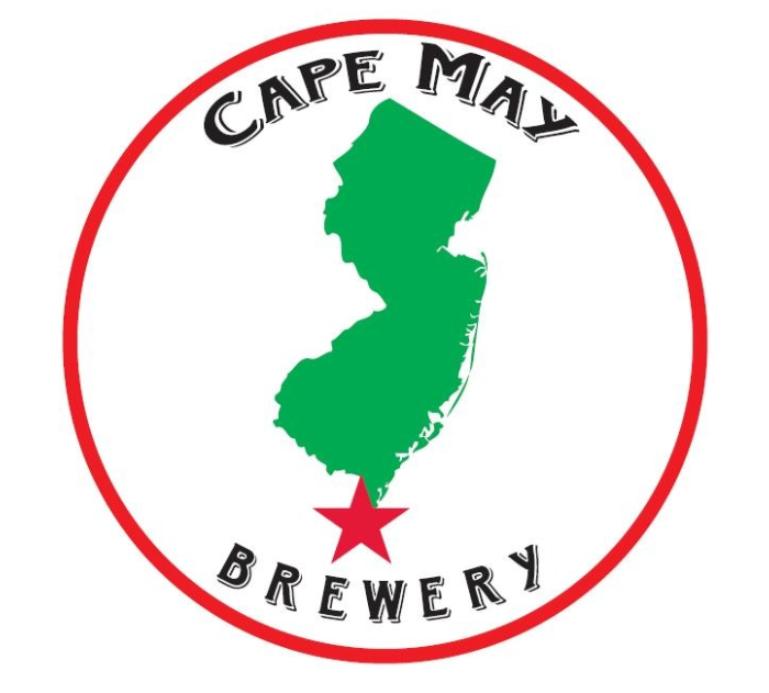
Those two images -- Clare’s logo and Ryan’s tap handle -- eventually combined to create the first iteration of the logo we all know and love.
While it came out great, it was the logo equivalent of having mom pick out your clothes. It was borne from necessity, and couldn’t accurately represent what we were as a company because we were just barely a company. We didn’t know who we were or what we stood for. But, despite all of that, the logo worked.
Fast-forward a few years, we wanted to revamp our website. Our first attempt at a website was designed by a Stockton student using historic maps from Rutgers, and Ryan and Hank revamped it throughout the years. Again, it worked, but it was utilitarian and didn’t really speak to who we are as a company.

Charged with spearheading this process, Marketing Communications Manager Alicia Grasso started reaching out to web designers and found that they all had the same questions for her.
“They said, ‘Who are you as a company?’ ‘What defines your company’s culture?’ ‘What does your current branding say about you?’ and ‘Where do you see yourself in five years?’,” she said.
Those are some important and challenging questions. After five years of being the rambunctious new kid on the block, now we have to define ourselves?
We weren’t ready for this shopping trip with mom. We could either half-ass it and just get a nicer website, or we could sit down and answer those questions and do it right.
Over the intervening eighteen months, that’s what we did. We took a long, hard look in the mirror. We needed to decide who we were before we could decide what clothes we wanted to wear.
During that time, we devised seven Core Values that define us as a company. We wrote a Mission Statement. We figured out why it was that we were here to begin with: “To build a brewery that makes us proud.”

Armed with that knowledge, we were able to say what we were all about. In marketing-speak, we defined our brand attributes.
“It’s important to be able to do that,” Ryan says. “It’s Marketing 101: know who you are. You’re not going to be able to get other people interested in what you do if you don’t really know what that is.”
So, thanks to this process, now we know. We’re hugely influenced by the community of Cape May. It’s the laid-back-est of the laid back beach communities. It’s fun, yet classy. It’s both old-school and hip. It’s the best the Jersey Shore has to offer.
We’re influenced by the sea. The Coast Guard is a huge presence in this area, and that’s had an influence on us, as well.
If we were to look at our development from a nature vs. nurture standpoint, nurture wins out every time, with the strength and beauty of this community influencing every step we take.

The new logo reflects that. It’s windswept and, for lack of a better word, “beachy”. You can feel the breeze. You can see the umbrellas flapping in the wind. You can hear the surf crashing and the gulls overhead. You can smell the salt air.
And note those three gulls. One each for Ryan, Hank, and Mop Man.
“You just feel cooler,” Ryan says, “our new look evokes a refreshing, relaxed feeling -- like a cold beer on a hot day.”
Over the past few weeks, you may have noticed our new hashtag: #craftedonthecape. It speaks to what we’re doing and where we’re doing it. It wasn’t something we sat down to figure out -- that new slogan was devised organically. It was just something someone said during this process -- but it’s unique and right on the money.

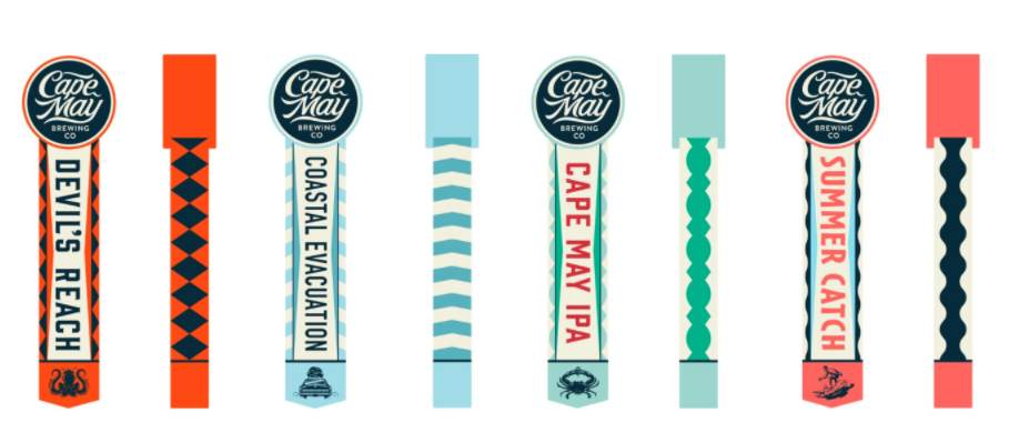
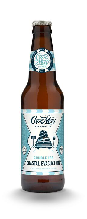
In addition to the new logo and website, we’ve got new bottle designs up our sleeve, as well. Thus far, our bottle designs have been one-offs with no real connection to each other. Graphic Designer Courtney Rosenberg has done a great job with them, but it’s not always easy to tell that Cape May IPA and Coastal Evacuation are made by the same company. We needed to unify our brand.
Our new look instantly communicates CMBC. You’ll be able to find new releases easier, as they’ll all have the same basic design, with notable changes between them.
“With consistent use of pattern and color, our fans will be able to find us with confidence,” Ryan says.

Some cool little tidbits on the bottles: each has pairing suggestions, so you’ll know the right beer to drink with your favorite meal. And we’ve got the correct glassware on there, too, so you can amaze your friends with your extensive beer knowledge.
But just like mom’s heart breaks a little each time she sees her kids assert a little more independence, leaving behind the New Jersey logo was not an option. It’d break our hearts.

But that’s why we’ve decided to continue reppin’ Jersey. Each of our bottles have “New Jersey Proud” emblazoned on them.
Because we are. We’re proud to be from New Jersey. This state and this community has made us who we are today. Without that influence, we’d still have no idea who we are.
But the important thing to remember is that we’re not changing in any way. It’s only our look that’s new -- the beer is the same beer you’ve come to know and love.
“We’ve always had a strong commitment to quality,” Ryan says, “and we wanted our packaging to reflect that.”
Throughout this process, we’ve been guided by Canales & Co., particularly its founder Jose Canales.
“Jose has been absolutely fantastic,” Ryan says. “Throughout this process, Jose guided us in a way that was introspective and thoughtful.”
Hank agrees. “Jose was highly collaborative and extraordinarily insightful. The new design he’s created sets an expectation of quality,” he says, “and the beer inside exceeds that expectation.”

Most importantly, the trust we’ve earned from the community is reflected in the design. We want you to be able to trust that you’re getting a quality CMBC product, and the new look does exactly that.
“This isn’t a change,” Ryan says. “We just found a way to communicate our identity.”
Just like you did when you went shopping with mom the summer before sixth grade. It took you that long to figure out who you are, and you wanted your new look to communicate your newfound identity.
Same here.
Ryan, Hank, and Mop Man called a State of the Brewery meeting to unveil the brewery’s worst kept secret -- this redesign. We tried to keep it under our hats, but, like Jimmy says, trying to keep a secret at a brewery is like trying to keep a secret at an old lady’s knitting club.
The new logos and designs were met with thunderous applause from the Brew Crew, which was quite a relief. After all, they’ve shaped who we’ve become in ways beyond imagining. Their commitment to our growth and expansion is what’s gotten us to this point. They’re our biggest fans, and their positive response was important.
While we like it, we also hope you like the new look. We hope it serves all the purposes we set out to serve. This has been a fulfilling, introspective, collaborative, long, and thoughtful process, but, ultimately, it’s been extraordinarily rewarding.
Like the family huddled together in our hilarious new Coastal Evacuation icon, we’re setting out on a journey with all of our baggage with us. That little car is CMBC, and all of that gear is everything that’s gotten us to this point.
And that includes you. You’re in that little car with us.
We’re thankful you’ve supported us thus far, and we’re thrilled to have a few companions on this ride.